Photoscene support was added 25th October 2017
There is an example photoscene mod included in the sdk. open it to see how it works. It is also available on the Steam Workshop as a mod.
Workflow
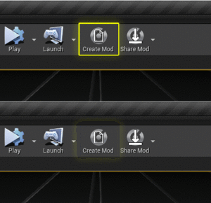
- create a mod
- create and design a level
- create and fill out a Photoscene Level Preview file.
- create Thumbnail(s)
- (Optional) Create a photoscene Widget for player-customization
- Share your mod
Create A New Blank Mod
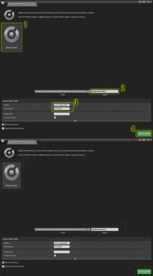
- Create a new Mod from the Blank Template
- fill out the wizard and press Create Mod
Create a New Blank Level
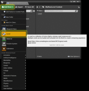
Create a new blank level in your mod plugin folder. Name it whatever you'd like.
Open the level by double-clicking it.
Design your level
do whatever you want to make your level be what you want.
This is not anything particular to Automation, but UE4 in General. Watch some of Epic's tutorials on this: https://www.youtube.com/watch?v=cl_eoVfNDKU&list=PLZlv_N0_O1gak1_FoAJVrEGiLIploeF3F
Level Creation Guidelines
- The cars in-game check collisiongeometry 6m above the car and 2m below it for placing on the ground. Make sure any roofing or props in this range dont have collision enabled, or you're going to have a bad time trying to move the car in the photoscene.
- Search the content browser for
A Car Locator.- These are the bookmarks for sub-level positions.
- Place them wherever you want the car to be, and in the Details panel, give them a name.
- This name will show up in the levels menu in the photoscene as one of the sub-level positions.
- You can have as many as you want.
- if none are present, the car will spawn at 0,0,0
- Currently, Stationary Lights are broken for Automation. use either static or movable lighting in your scenes.
Adding Customization Options To Your Photoscene
Beginning with LCv4.2, Automation supports player-customizable options for individual photoscenes.
You can set up your photoscene to allow the player to change the colour of the lighting, the time of day, whether street lights are turned on, etc... the world is your oyster!
Creating a Photoscene Widget
From the Content Browser, add a Widget Blueprint to your mod folder.
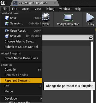
Open the Widget, and from the File menu, select Reparent Blueprint.
In the menu that appears, find and select Photo Scene Widget Base.
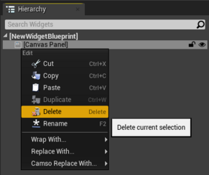
From the Hierarchy window, delete the Canvas Panel.
You are now free to design the buttons, sliders, and drop-down menus, etc... to your heart's content!
Quick Tips:
- Add all your buttons and options under a parent Vertical Box
- your widget will appear under the
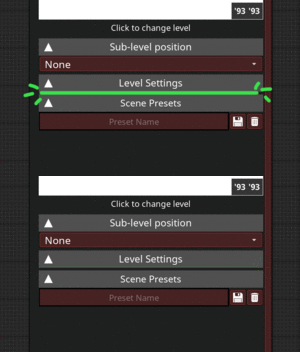
Level Settingsmenu in the Photoscene, and as such do not have much horizontal space to work with.
- your widget will appear under the
- There are a few preset buttons and sliders you can use that will make your life easier. These can be searched for and used from the Palette menu, but feel free to design your own:
- Slider_Photo_Manager
- UW_DropDown_Photoscene
- Photoscene_Checkbox_UW
- UW_TextBox_Photoscene
Using The Slider_Photo_Manager
The Slider_Photo_Manager is a slider with a title text, plus and minus buttons, and a text box for the current value which can be set and overridden by the player.
It has a Value Changed event that is called whenever the player changes the value of the slider, and this event should be utilized for setting your Photoscene settings.
The Value Changed event returns a float value.
The Slider_Photo_Manager has a few settings of note:
- Min Value:
- Defines the minimum number that the slider can naturally reach.
- Can be overridden using the text box by the player.
- Default is 0.
- Max Value:
- Defines the maximum number that the slider can naturally reach.
- Can be overridden using the text box by the player.
- Default is 1.
- Sig Figs:
- Defines the number of significant figures that will be displayed in the text box.
- Default is 3.
- Step Count:
- Defines the number of steps that are available in the slider.
- Default is 100.
- Useful when the slider range is massive, and you dont want the player to have to scrub through all values you may have available.
- For instance: if your slider has a min range of 0, and a max of 500, it may take the player a long time to incriment the value with their scroll wheel or using the +/- buttons, so setting a step count of 10 will mean that the player only has to press '+' 10 times to get from 0 to 500.
- Title Text:
- The text to display next to the slider. Useful for telling the player what this slider does.
- Default is empty/no text.
- Display Whole Numbers Only:
- Is a boolean, default is False.
- When True, ignores the
Sig Figsvalue only when the number of significant integers is less than the number of significant figures. - Will only display integer values, and ignores any fractional values the slider may have set.
- For instance, if you have a slider with a min of 0, a max of 3, and 30 steps, it is possible for the player to get any single-digit fraction of each integer (0, 0.1, 0.2, 0.3......... 1, 1.1, 1.2, 1.3....... 2, 2.1, 2.2, 2.3..... etc), and while you may want this functionality, you may not want to display that fractional value. Enabling this setting will mean that while the player can set the slider to 4.6, say, the slider will display that the value is 4, despite the actual value being 4.6.
Using The UW_DropDown_Photoscene
The UW_DropDown_Photoscene is a drop-down menu, with a title text, and a variable number of list options.
It has a Value Changed event that is called whenever the player changes the selected option. It returns a String value and an Integer Index value when called. The String value is the string text of the selected option, while the Index integer is the position of the currently selected string value in the array/list.
Remember that arrays start at 0. For example: a drop-down with four values, say, one on, one off, both on, both off, will have selected integers of 0,1,2,3, respectively. If the player Selects one off, the Value Changed event will return a string value of one off, and an index of 1.
The UW_DropDown_Photoscene has a few settings of note:
- Title Text:
- The text to display next to the drop-down. Useful for telling the player what the drop-down does.
- Default is empty/no text.
- Options:
- The number and names of the options available in the drop-down.
- You can have as many or as few as you want.
- Default is empty/no values.
- Selected Option:
- The string value of the default selected option for this drop-down.
- Should be identical to one of the
Optionslist items. - Default is empty/no value.
Using The Photoscene_CheckBox_UW
The Photoscene_CheckBox_UW is a tickbox/checkbox/disabled+enabled buttons.
It has a Value Changed event that is called whenever the player changes the setting. It returns a boolean which is True when the value is ticked/enabled/true, and returns False when the value is un-ticked/disabled/false.
It has a few settings of note:
- Title Text:
- The text to display next to the setting. Useful for telling the player what the setting does.
- Default is empty/no text.
- Default Value:
- Is a boolean. Sets the default value of this setting.
- Default is un-ticked/disabled/false.
- Use Buttons:
- Is a boolean. Switches the widget between the default disabled/enabled buttons, and a small check box with a disabled/enabled text. Useful for some things.
- Default is un-ticked/disabled/false.
Using The UW_TextBox_Photoscene
The UW_TextBox_Photoscene is a simple text box.
It has a Text Updated event that is called whenever the text changes from player input. It returns a String text which is the value of the text box.
It has a few settings of note:
- Text:
- Is the default text to display in the text box.
- Default is none/no text.
- Title Text:
- The text to display next to the setting. Useful for telling the player what the setting does.
- Default is empty/no text.
Widget Functionality
The Photo Scene Widget Base parent type has a few function calls that you should be aware of, and use where necessary.
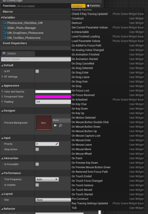
From the 'Graph' view, hover over the Functions menu, and select Override.
Don't worry if these are overwhelming you, they will be explained more in-depth later.
- Check If Ray Tracing Updated:
- Is called whenever any ray-tracing settings are updated.
- This should mostly be ignored, as it is an internal function, but can be overridden if you find yourself running into discrepancies between ray-tracing and non-ray-tracing in your level.
- Most discrepancies in ray-tracing are related to shadows and reflections, and as such, there is another function that should be used before this one. However, if you find yourself still struggling to get a scene looking good for both ray-traced and non-ray-traced graphics, then override this.
- Get Current Parameter Values:
- Is called by the Photoscene whenever it needs to ask this widget what the current UI values are.
- The 'Return' node of this function is an array of
Photo_Scene_Parameter_Structvalues. - This should be used to send the values of your UI to the Photoscene Preset's 'return' node.
- Level Finished Loading:
- Is called whenever the Photoscene level has finished loading.
- This is a safe way to initialize any values you want to set for the level or UI. when the photoscene is loaded from the level selection menu or a preset.
- Load Parameter Values:
- Is called when the Photoscene is loading your level from a preset.
- Paths in an array of
Photo_Scene_Parameter_Structvalues. - This should be used to initialise your UI values, and apply their related settings to your level.
- On Initialized:
- Should be ignored, as it is an internal function.
- Ray Tracing Settings Updated
- Is a helper function designed to call whenever a ray-tracing setting related to reflections, refraction, or shadows, is adjusted.
- It Paths in a boolean that is True if any RT shadow, reflection, or translucency setting is enabled.
- If you need further functionality for switching things when ray-tracing is on, please refer to the
Check If Ray Tracing Updatedfunction.
Go to the Modding page to see how to share your mod.
