About the Photo_Scene_Parameter_Struct
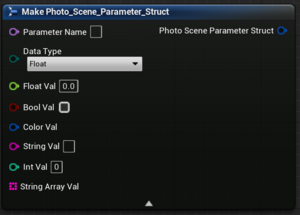
The Photo_Scene_Parameter_Struct is the combination name/value pair setting that is used for all photoscene/preset save game values. It is used by Photoscenes, and Props.
It consists of three primary settings:
- Parameter Name:
- Is the name/identifier for this setting. It is not displayed in-game, but is instead used in the save game file to store the identifier for this current variable. These need to be unique for all variables in this widget.
- Data Type
- Is the type of value being stored in this parameter.
- Ties in with the #Value.
- Each parameter can only contain one type of data, so chose wisely.
- Value
- For the current parameter name and data type, this value is used. Match it to the
Data Typesetting.
For instance, if you have a slider that affects Brightness, you would have a Parameter Name of something identifiable, like Brightness, a Data Type of Float, and a Float Val equal to your slider value. If you had a checkbox instead, you would use a data type of bool and a bool val equal to your checkbox value.
For each setting your widget can change, you should use one Photo_Scene_Parameter_Struct.
Using the Photoscene Widgets
There are many pre-made widgets that you can use which will help you make photoscene widgets easier. They are as follows:
Using The Photoscene_Slider_UW
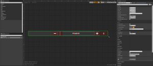
The Slider_Photo_Manager is a slider with a title text, plus and minus buttons, and a text box for the current value which can be set and overridden by the player.
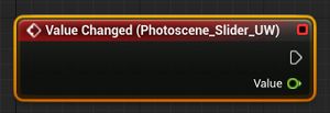
It has a Value Changed event that is called whenever the player changes the value of the slider, and this event should be utilized for setting your Photoscene settings.
The Value Changed event returns a float value.
The Slider's Settings
The Slider_Photo_Manager has a few settings of note:
- Min Value:
- Defines the minimum number that the slider can naturally reach.
- Can be overridden using the text box by the player.
- Default is 0.
- Max Value:
- Defines the maximum number that the slider can naturally reach.
- Can be overridden using the text box by the player.
- Default is 1.
- Sig Figs:
- Defines the number of significant figures that will be displayed in the text box.
- Default is 3.
- Step Count:
- Defines the number of steps that are available in the slider.
- Default is 100.
- Useful when the slider range is massive, and you dont want the player to have to scrub through all values you may have available.
- For instance: if your slider has a min range of 0, and a max of 500, it may take the player a long time to incriment the value with their scroll wheel or using the +/- buttons, so setting a step count of 10 will mean that the player only has to press '+' 10 times to get from 0 to 500.
- Title Text:
- The text to display next to the slider. Useful for telling the player what this slider does.
- Default is empty/no text.
- Display Whole Numbers Only:
- Is a boolean, default is False.
- When True, ignores the
Sig Figsvalue only when the number of significant integers is less than the number of significant figures. - Will only display integer values, and ignores any fractional values the slider may have set.
- For instance, if you have a slider with a min of 0, a max of 3, and 30 steps, it is possible for the player to get any single-digit fraction of each integer (0, 0.1, 0.2, 0.3......... 1, 1.1, 1.2, 1.3....... 2, 2.1, 2.2, 2.3..... etc), and while you may want this functionality, you may not want to display that fractional value. Enabling this setting will mean that while the player can set the slider to 4.6, say, the slider will display that the value is 4, despite the actual value being 4.6.
Doing Things When The Slider Changes
To use the slider, you must use the Value Changed event. To do so, scroll to the bottom of the Photoscene_Slider_UW's details, and click the green plus icon next to Value Changed:
This will create a new event in your timeline:
you can then do whatever you want to do whenever the player changes the slider's value.
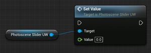
To set the slider's value yourself, such as when loading a value from a preset, call the Set Value function:
Using The UW_DropDown_Photoscene
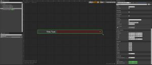
The UW_DropDown_Photoscene is a drop-down menu, with a title text, and a variable number of list options.
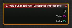
It has a Value Changed event that is called whenever the player changes the selected option. It returns a String value and an Integer Index value when called. The String value is the string text of the selected option, while the Index integer is the position of the currently selected string value in the array/list.
Remember that arrays start at 0. For example: a drop-down with four values, say, one on, one off, both on, both off, will have selected integers of 0,1,2,3, respectively. If the player Selects one off, the Value Changed event will return a string value of one off, and an index of 1.
The UW_DropDown_Photoscene's Settings
The UW_DropDown_Photoscene has a few settings of note:
- Title Text:
- The text to display next to the drop-down. Useful for telling the player what the drop-down does.
- Default is
Title Text.
- Options:
- The number and names of the options available in the drop-down.
- You can have as many or as few as you want.
- Default is empty/no values.
- Selected Option:
- The string value of the default selected option for this drop-down.
- Should be identical to one of the
Optionslist items. - Default is empty/no value.
Doing Things When The Drop-Down Changes
To use the drop-down, you must use the Value Changed event. Scroll down to the bottom of the UW_DropDown_Photoscene's details settings, and click the plus icon next to the Value Changed event:
this will create a new event in your timeline:
you can then do whatever you want to do whenever the player changes the drop-down's value.
To set the drop-down's value yourself, such as when loading a value from a preset, call the Set Selected Index function:
Using The Photoscene_CheckBox_UW
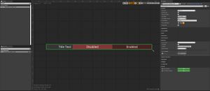
The Photoscene_CheckBox_UW is a tickbox/checkbox/disabled+enabled buttons.
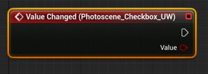
It has a Value Changed event that is called whenever the player changes the setting. It returns a boolean which is True when the value is ticked/enabled/true, and returns False when the value is un-ticked/disabled/false.
The Photoscene_CheckBox_UW's Settings
It has a few settings of note:
- Title Text:
- The text to display next to the setting. Useful for telling the player what the setting does.
- Default is empty/no text.
- Default Value:
- Is a boolean. Sets the default value of this setting.
- Default is un-ticked/disabled/false.
- Use Buttons:
- Is a boolean. Switches the widget between the default disabled/enabled buttons, and a small check box with a disabled/enabled text. Useful for some things.
- Default is un-ticked/disabled/false.
Doing Things When The Checkbox Changes
To use the checkbox, you must use the Value Changed event. Scroll down to the bottom of the Photoscene_CheckBox_UW's details settings, and click the plus icon next to the Value Changed event:
this will create a new event in your timeline:
you can then do whatever you want to do whenever the player changes the checkbox's value.
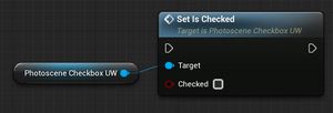
To set the checkbox's value yourself, such as when loading a value from a preset, call the Set Is Checked function:
Using The UW_TextBox_Photoscene
The UW_TextBox_Photoscene is a simple text box.
It has a Text Updated event that is called whenever the text changes from player input. It returns a String text which is the value of the text box.
The UW_TextBox_Photoscene's Settings
It has a few settings of note:
- Text:
- Is the default text to display in the text box.
- Default is none/no text.
- Title Text:
- The text to display next to the setting. Useful for telling the player what the setting does.
- Default is empty/no text.
Doing Things When The Textbox Changes
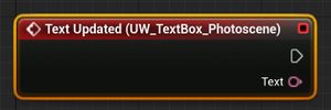
To use the Textbox, you must use the Text Updated event. Scroll down to the bottom of the UW_TextBox_Photoscene's details settings, and click the plus icon next to the Text Updated event:
this will create a new event in your timeline:
you can then do whatever you want to do whenever the player changes the Textbox's value.
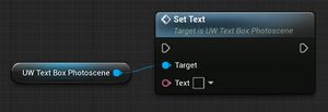
To set the Textbox's value yourself, such as when loading a value from a preset, call the Set Text function:
Using The Photoscene_ColourPickerAdvanced_UW
The Photoscene_ColourPickerAdvanced_UW is a colour picker. It allows the player to chose a colour by adjusting three sliders. It has two modes: RGB, and HSV. In RGB mode, the three sliders represent the Red, Green, and Blue colour values for the colour. In HSV mode, the three sliders represent the Hue, Saturation, and Value (brightness) of the colour. It also has a hexadecimal code input.
It has a Colour Updated event that is called whenever the player changes the colour setting. The Colour Updated event returns two values: A Colour value, which represents the colour that the player has currently selected, and a Temporary Change boolean, which should be left unused unless you wish to enable Advanced View, in which case this value represents whenever the value is temporarily set to default via the Enable tickbox.
The Photoscene_ColourPickerAdvanced_UW's Settings
It has a few settings of note:
- Title Text
- The text to display next to the setting. Useful for telling the player what the setting does.
- Default is empty/no text.
- Default Value
- The default value of the colour picker, if not overridden.
- This is also the value that the colour picker will revert to, if Advanced View is on, and the player un-ticks the Enable tickbox.
- The default value is
1,1,1.
- Default Mode
- The default mode determines whether the colour picker will appear to the user in RGB or HSV mode by default.
- The default value is
RGB.
- Include Luminosity
- When enabled, this setting changes the way the colour picker works, by making all the settings that affect the value of the colour to go from 0-2, instead of the default 0-1. This is used primarily internally for colour grading, as it allows the colour grading settings to desaturate as well as oversaturate the colours, which would not be possible if the colour picker could only go between 0-1 values.
- The default value is
False.
- Advanced View
- This enables the advanced mode for this widget. When enabled, a new tick-box appears to the left of the Title field.
- The player can enable or disable the tick-box, which enables or disables the colour picker.
- When the colour picker is disabled, the player cannot input anything to the colour picker, and the colour value from the
Colour Updatedevent is called with the colour from the Default Value. - When the player re-enables the colour picker, the colour picker can again be edited by the player, and the
Colour Updatedevent is again called, this time with the value from the colour picker. - When the
Colour Updatedevent is called, theTemporary Changevalue that is returned along with theColourvalue represents whether the Enable tick-box was just un-checked. TheTemporary Changevalue returns1only when the Enable check-box is disabled. - The default value is
False.
- Show Title
- When enabled, the title text is visible. When disabled, the title text is hidden and colapsed.
- The default value is
True.
- Title Width
- This determines the width of the title text field, in slate units (pixels). For consistency, this should be left at its default value.
- This setting is useful when your colour picker is contained within an
Expandable Area Camso, as we usually indent their contents by 42px. For consistency, we like to make sure the title text is the part that shrinks by that 42px, such that the actual colour picker field remains aligned. When such a situation occurs, the Title Width is usually set toCustom, in which case the width of the title text is determined by theTitle Width Overridevalue. - The default value is
Text (180px).
- Title Width Override
- The Title Width Override is used only when the Title Width is set to Custom. When this is the case, the width of the title text is determined by this value.
- The default value is
138px.
- Num Indents
- As an alternative to using the
Title WidthandTitle Width Overridevalues, you can instead increase theNum Indentsvalue, which decreases the width of the Title text by 42px (or whatever theIndent Sizevalue is set to) for each integer ofNum Indents. - The default value is 0.
- As an alternative to using the
- Indent Size
- This is the value that affects how much the title text is shrunk by, as used by
Num Indents. - The default value is 42.
- This is the value that affects how much the title text is shrunk by, as used by
Doing Things When The Colour Picker Changes
To use the Colour Picker, you must use the Colour Updated event. Scroll down to the bottom of the Photoscene_ColourPickerAdvanced_UW's details settings, and click the plus icon next to the Colour Updated event:
this will create a new event in your timeline:
you can then do whatever you want to do whenever the player changes the Colour Picker's value.
To set the Colour Picker's value yourself, such as when loading a value from a preset, call the Set Value function:
